Показаны сообщения с ярлыком visualisation. Показать все сообщения

вторник, 25 декабря 2018 г.

Information mapping


Information mapping is a research-based method for writing clear and user focused information, based on the audience's needs and the purpose of the information. The method is applied primarily to designing and developing business and technical communications. It is used as a content standard within organizations throughout the world.

Overview of the information mapping method

The information mapping method is a research-based methodology used to analyze, organize and present information based on an audience's needs and the purpose of the information. The method applies to all subject matter and media technology. Information mapping has close ties to information visualizationinformation architecturegraphic designinformation designdata analysisexperience design, graphic user interface design, and knowledge management systems.

Components of the method

Information mapping provides a number of tools for analyzing, organizing and presenting information.

Information types

Some of Robert E. Horn's best-known work was his development of the theory of information types. Horn identified six types of information that account for nearly all the content of business and technical communications. The types categorize elements according to their purpose for the audience:
Information TypeDescription
ProcedureA set of steps an individual performs to complete a single task
ProcessA series of events, stages or phases that occurs over time and has a specific outcome
PrincipleA statement designed to dictate, guide or require behavior
ConceptA class or group of things that share a critical set of attributes
StructureA description or depiction of anything that has parts or boundaries
FactA statement that is assumed to be true

Research-based principles

The information mapping method proposes six principles for organizing information so that it is easy to access, understand, and remember:
PrincipleDescription
ChunkingBreak up information into small, manageable units
RelevanceLimit each unit of information to a single topic
LabelingLabel each unit of information in a way that identifies its contents
ConsistencyBe consistent in use of terminology as well as in organizing, formatting and sequencing information
Accessible detailOrganize and structure information so those who need detail can access it easily, while those who don't can easily skip it
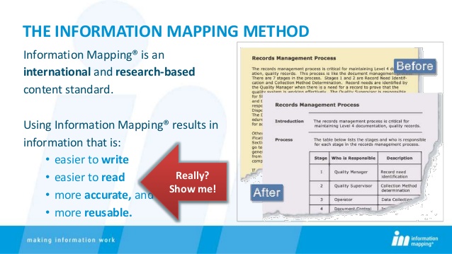
Integrated graphicsUse graphics within the text to clarify, emphasize and add dimension

Units of information

Documents written according to information mapping have a modular structure. They consist of clearly outlined information units (maps and blocks) that take into account how much information a reader is able to assimilate.
There is an essential difference between an information unit and the traditional text paragraph. A block is limited to a single topic and consists of a single type of information. Blocks are grouped into maps, and each map consists only of relevant blocks. The hierarchical approach to structuring information greatly facilitates electronic control of content via content management systems and knowledge management systems.

Advantages of information mapping

The information mapping method offers advantages to writers and readers, as well as to an entire organization.

Advantages for writers

Information mapping offers these advantages for writers:
  • An easily learned systematic approach to the task of writing that once learned, enables writers to minimize down time and start writing immediately
  • A subject-matter independent approach that can be applied to all business-related or technical content
  • A content standard that greatly facilitates team writing and management of writing projects
  • Enhanced writer productivity, with less time required for both draft development and review, and
  • Easy updating and revision of content throughout its life cycle

Advantages for readers

Information mapping offers these advantages for readers:
  • Quick, easy access to information at the right level of detail, even for diverse audiences
  • Improved comprehension
  • Fewer errors and misunderstandings
  • Fewer questions for supervisors, and
  • Shorter training cycles, less need for re-training

Advantages for organizations

Also an entire organization can benefit from using a content standard like information mapping if the method is used with the following objectives in mind:
Revenue growth by reducing time to create content and accelerating time to market
  • Cost reduction by capturing employee knowledge, increasing operational efficiency, reducing support calls, and decreasing translation costs
  • Risk mitigation by increasing safety and compliance

History[edit]

Information mapping was developed in the late 20th century by Robert E. Horn, a researcher in the cognitive and behavioral sciences. Horn was interested in visual presentation of information to improve accessibility, comprehension and performance. Horn's development of the information mapping method has won him recognition from the International Society for Performance Improvement and the Association for Computing Machinery.

Review of research

Many independent studies have confirmed that applying the information mapping method to business and technical communications results in quicker, easier access to information, improved comprehension and enhanced performance. It also facilitates repurposing for publication in different formats.[citation needed]
Doubts have been raised over the strength of the research Horn uses to justify some of his principles. For instance, his chunking principle requires lists, paragraphs, sub-sections and sections in a document to contain no more than 7±2 chunks of information.[1] Horn does not state where he got this principle, but an Information Mapping website stated that the principle is "based on George A. Miller's 1956 research".[2] Miller did write a paper in 1956 called "The Magical Number Seven, Plus or Minus Two: Some Limits on our Capacity for Processing Information", but its relevance to writing is tenuous.[3] Miller himself said that his research had nothing to do with writing.[4] Insisting that lists, paragraphs, sub-sections and sections throughout a document contain no more than 7±2 chunks of information paradoxically assumes that the size of what is not read in a document can influence a reader's ability to comprehend what they do read.[3]

References[edit]

  1. ^ R.E. Horn, Developing Procedures, Policies & Documentation, Info-Map, Waltham, 1992, page 3-A-2.
  2. ^ "Mapping FAQs". Infomap.com. Archived from the original on 2010-02-18. Retrieved 2017-03-14.
  3. Jump up to:a b Geofrey Marnell, Essays on Technical Writing, Burdock Books, Brighton, 2016, pp. 111–155).
  4. ^ See http://members.shaw.ca/philip.sharman/miller.txt, Viewed 14 January 2011.

Further reading[edit]

  • Robert E. Horn. Mapping Hypertext: The Analysis, Organization, and Display of Knowledge for the Next Generation of On-Line Text and GraphicsISBN 0-9625565-0-5
  • Robert E. Horn. How High Can it Fly? Examining the Evidence on Information Mapping's Method of High-Performance Communication. Note: This publication is available for download on Horn's website: Chapter One and Chapter Two.

Information Mapping is a documentation methodology, developed by Robert E. Horn in 1972. Documents developed according to the Information Mapping methodology have an instantly-recognizable visual style. This is probably because most authors (or organizations) adopting the methodology focus on the style of the Information Mapping documentation itself, copying the style used by Information Mapping Inc. for their own documentation on Information Mapping. However, Information Mapping really stipulates the structure of the information, rather than the visual display of it. It is perfectly possible to adhere to the methodology but use a visual style that is markedly different to what is commonly thought of as 'Information Mapping documentation'.
Information Mapping is built on seven key principles. These are:
  1. Chunking;
  2. Relevance;
  3. Labeling;
  4. Consistency;
  5. Integrated graphics;
  6. Accessible detail;
  7. Hierarchy of chunking and labeling.

Chunking

The methodology states that:
"Writers should group information into small, manageable units."
Information Mapping defines a 'manageable unit' as "no more than nine pieces of information", which is based on the oft-quoted 'seven-plus-or-minus-two' rule. Information Mapping dictates that this should apply to all levels of documentation - so a manual should have no more than nine chapters, and a bulleted list should have no more than nine list items. However, as discussed in Writing user instructions, this is not always practicable or necessarily desirable. That said, this principle - that information should be grouped into small, manageable units - is good advice from a comprehension perspective.

Relevance

The methodology states that:
"Writers should make sure that all information in one chunk relates to one main point based on that information's purpose or function for the reader."
Put simply, this rule states that a block of information should contain only one type of information. This means that you should not mix (for example) instructions with descriptions. Obviously both of these types of information are permissible (and often necessary) within the same publication. Information Mapping just states that they should be in separate 'blocks' within the document. So you may have a section called "How the XYZ works" and another called "Replacing the widget on the XYZ".

Labeling

The methodology states that:
"After organizing related sentences into manageable unit, writers should provide a label for each unit of information."
This rule states that each 'chunk' of information should have a 'label'. Many proponents of Information Mapping think that this label should appear (traditionally) on the left of the block of information, and word-wrapped within the label column. However, this is not strictly necessary. It is perfectly valid for the label to appear as a 'normal' heading that stretches into the 'content' column. In this context, 'labeling' is best interpreted as providing adequate headings, although headings will typically appear much more often in documents developed according to the Information Mapping methodology than in 'regular' documents.

Examples:
1. 'Traditional' Information Mapping block:

Company policy for system Userids

All users are required to keep their password secret. Users must change their password the first time they log onto the system, and then once a month thereafter. If a user does not change their password for 35 days, they will be prompted to do so by the sytem when they attempt to log on.
2. Adapted Information Mapping block:
Company policy for system Userids
 All users are required to keep their password secret. Users must change their password the first time they log onto the system, and then once a month thereafter. If a user does not change their password for 35 days, they will be prompted to do so by the sytem when they attempt to log on.

The important thing to remember is that labels must stand out from the text, to allow quick scanning (navigation via the labels). For this reason, it is recommended that the 'content' is always significantly indented (as shown in Example 2 above).

Consistency

The methodology states that:
"For similar subject matters, writers should use similar words, labels, formats, organizations, and sequences."
Consistency should be adhered to on two levels:
  • Consistency in language;
  • Consistency in format and structure.
Consistency in the language used within a document and across multiple documents within the same documentation set is important, as readers will rapidly become accustomed to the language used and will not have to 'decipher' the text. That is, they will not have to think about the meaning of a word, but will know intuitively (based on their earlier intraction wih this word) what is meant. If you use different words or phrases for the same thing, the user will be required (perhaps subconsciously) to decide each time whether this actually is the same thing as was referred to previously, or is something different. This will increase the time it takes them to assimilate the information.
Consistency in the format and structure of a document is also important. Within a single document, headings should be used consistently. This includes using the same size and typeface for headings at the same level, and also using headings at the same level of granularity. Across documents, consistency can be thought of as providing the same information in the same type of document. For example, if you are developing a suite of user procedures, then every user procedure document should contain the same information, at the same point in the document, and using the same headings and labels.

Integrated graphics

The methodology states that:
"Writers should use diagrams, tables, puictures, etc. as an integral part of the text, not as an afterthought added on when the writing is complete."
This simply means that graphics should be included wherever they are useful. This rule was probably included as a reaction to the prepondency for text-only documents. Integrating graphics typically gives a document a 'lighter' (less-dense) feel, and therefore facilitates comprehension. There are also times when a picture can show instantly what it would take several paragraphs of text to explain.
However, graphics in technical communications must always be functional. The Information Mapping documentation states that "approximately 50 percent of the adult population learns better from pictures and other graphics than from words", but this means that approximately 50% learn better from text! Therefore, graphics should always be in support of the text, and not as an alternative to it.
Note that Information Mapping considers tables to be 'graphics' as well - which explains their extensive use in Information Mapping. However, given that most tables contain text only, it is better to exclude tables from the definition. This allows you to better focus on 'real' graphics (including photos, technical illustrations, and charts and graphs) and identify opportunities for including these in a document.

Accessible detail

The methodology states that:
"Writers should write at a level of detail that makes the information the reader needs readily accessible, and makes the document usable for all readers. In other words, put what the reader needs where the reader needs it. Include clearly labeled overviews, reviews, descriptions, diagrams, and examples for all "abstract" presentations. Place the diagrams, and examples close tothe text they illustrate."
This principle can best be interpreted as simply providing information to a level of detail that is useful to the readers, and then making sure that the readers can easily-locate the relevant detail.
For example, in a set of maintenance instructions, saying simply "Remove the spigot shaft" may not be sufficient. Perhaps the reader does not know how to do this. Consider providing instructions explaining exactly how to remove it. Perhaps the reader is even unfamiliar with exactly what a spigot shaft is, and where it is located. So provide a diagram of one, and/or a photograph of a spigot shaft in-situ. Then clearly label each element - the instructions, the diagram and the photograph - so that users can directly locate them and understand what the element is showing.

Hierarchy of chunking and labeling

The methodology states that:
"Writers should organize small, relevant units of information into a hierarchy, and provide the larger group(s) they have created with a label(s)."
At its simplest, this rule simply means that:
  1. A document should have a title (label in Information Mapping terminology);
  2. The document should be split into sections (maps);
  3. Each section should have a title (label);
  4. Each section should be split into units of information (blocks);
  5. Each unit of information should have a title (label).
Some authors struggle with Information Mapping, thinking that there are only three levels within this hierarchy: document, map, and block. This assumption is largely borne out of using the Information Mapping documents as an example, and using the Information Mapping templates which indeed only include these three levels.
However, if you consider this rule in conjunction with the 'chunking' rule, it effectively supports as many levels of the hierarchy as is necessary - as long as each node in the hierarchy has no more than nine sub-nodes.

It is also often assumed that heading numbers are 'no allowed', but again, this is a fallacy. In a three-level hierarchy, where the document is the highest level, and there are no more than 9 nodes at each level, there is not really a need for section numbers. However, once additional levels are inroduced, or the number of nodes is increased, heading numbers - and specifically hierarchical heading numbers (1, 1.1, 1.2, 1.3, 2, 2.1....) can greatly aid navigation. Information Mapping does not explicitly forbid them, so they can be used where it helps.

Example:

Corporate Security Policy

1. Controls on system access

1.1 System userids

Each user will be granted a unique password-protected userid which will allow them access to all (and only) functions required to perform their job. Userids must not be shared with other users, under any circumstances.
1.2 System passwordsAll users are required to keep their password secret. Users must change their password the first time they log onto the system, and then once a month thereafter. If a user does not change their password for 35 days, they will be prompted to do so by the system when they attempt to log on.
2. Controls on physical access to buildings

2.1 Card key

etc.

среда, 5 июля 2017 г.

How To Think Visually Using Visual Analogies


Most research in cognitive science explores how we see things but little research is done on how we understand what we see.

Understanding is the ultimate test of how good your visualization is. So how can you make people understand? Show something familiar and analogize. If you know nothing else about visualization but pick the right analogy you are more than half way there. This is what a professional designer does - and there is no substitute for analogies.

How do you choose the right analogy? In this grid I organized analogies from the abstract down to the more detailed. I grouped them by similarity in shape. The goal is to enable you to quickly see the possibilities and “try them on” your information. With time you’ll be able to do all of this in your head. But for now this is a shortcut. 

Let’s start simple and abstract.

Charts, graphs, and diagrams

Let’s start with circular shapes.  (Most things in the universe are round!)

1. Pie Chart. The most popular and criticized. As Edward Tufte says, “…the only thing worse than one pie chart is lots of them”.  The father of modern infographics, Otto Neurath, also rejected pie charts in favor on the more semantic iconographics. Pie charts are best used when divided into two segments:  pie I’ve eaten and pie I have left.  With two segments you can still easily compare the slices in size - something that becomes difficult with more than two, hence the criticism.  Once you have three or more segments you have a comparison problem - our eyes are not used to comparing segments of a circle. We also are bad at comparing different pie charts. That leaves very few cases where a pie chart still works.

2. Venn Diagram. Here is another popular and misused analogy. One thing it does well - show overlap of two to three things. What it does not do well is show how large that overlap is. This diagram is better used when all you need to show is the overlap and nothing else, no data. 

3. Concentric diagram. This is an onion sliced sideways. In the middle is the most important thing, or the purpose of something. The importance should decrease going outward with every layer.

4. Circular chart. The principle here is comparing the length of something, where the whole circle is 100%. That mean we can’t change scale. This is a good way to display schedules, compare the lengths of lives, the time it takes to complete a project, etc. This is not good for showing periods that are so different in length that the smaller periods become invisible. 

5. Bubble chart. This chart is good for roughly comparing quantities. Again, circles are hard to compare precisely. But sometimes impreciseness is to our advantage. Some information is best digested in a rough comparison, especially if every circle is orders of magnitude larger or smaller. This works well for comparing vastly different budgets, stars and planets, populations of countries, nutritional values of foods, and so on.

6. Bubble race chart. Here we give meaning to the positions of bubbles. The closer to the top, the more educated the population of a particular country; or the hotter a star is. That is using the y axis only. Using both axes: the closer to the top and further to the right a bubble is, the more educated a population is and the longer they live.

7. Line chart - this chart is a series of points connected by straight lines - how dramatic the line looks quickly shows how something changes. This chart is versatile because it is so abstract. But little about it is memorable. Still, when the insight you want to communicate is just the changes in something - it works. This chart is the least infographic of all, with pie chart and bar chart not far behind.

8. Area chart - shows the difference between two or more line charts by filling with color the space below the line. Use this chart for trend comparison. 

9. Scatter plot - this chart works well for showing clusters and outliers. Here we want to show exactly where the values fall. The reader will not distinguish points inside clusters, but the points outside of clusters and the clusters themselves will grab the attention. 

10. Sunburst chart - (also ring chart or a multi-level pie chart) this is a pie chart with a hierarchy. There is meaning in how close a given pie chart is to the middle. For example, if the center is the beginning of time, then the closest pie chart is the first period since the beginning. Then you can show the periods within that period. This chart is commonly used to show disk space usage because there is a hierarchical relationship between folders in a computer and sub-folders.

11. Fan chart - shows things that double as they get further away from the center. It is used to show genealogy trees and evolution of ideas .

12. Windrose chart - shows how much of something goes into which direction. This chart started out as a way to show how strong the wind blew in each direction.

13. Bar chart - shows numbers through length of bars. Bar charts work better for showing a smaller number of values than bubble charts. The eye can easily compare the length of bars - use it when it’s important to show the exact value. But it’s better to not use it for comparison - use a tape diagram instead.

14. Tape diagram - shows ratios - how one number relates to another. Imagine you have a piece of tape to measure everything with. Your results will look like this: this is 2 pieces of tape long, this is 5 pieces of tape long, etc.  To make the diagram more meaningful, sections of tape can be substituted with simple icons.

15. Gantt chart - shows stretches of time and how they related to each other. This chart was first used for scheduling projects. Use it to show future predictions, court hearings, train schedules, etc.

16. Tree map - uses nested rectangles to show a hierarchy. This way you can divide rectangles into ever smaller ones (just make sure they are still visible). This way you can visualize budgets, then budgets within them, for example. 

17. Grid - is both a system for arranging things and a visual analogy. As a visual analogy it lets you know immediately that there is no hierarchy - every cell is equal. Yet, there is order. 

18. Periodic table - this is a grid where a cell the position within a column and /or row carries some meaning. For example, the more to the right your cell in the grid, the more reactive is the chemical element. Other examples are: the more to the right the more alcohol content a beverage has, but the further down the more sugar it contains.

19. Arc diagram - this one-dimensional diagram shows the interactions between any two nodes. It reveals patterns well.  Here are some ideas: wars between any two nations, interactions between characters of a novel, collaborations between music artists, etc.

20. Sankey chart - here the thickness of the line represents numbers. Think of a Sankey chart like a river flowing from the source. When the river starts it is one solid line, but as it flows down, it splits into the main river, smaller rivers, creeks, and streams.

21. Chord chart - similar to the arc diagram, a chord chart shows interactions between two nodes. The thickness of the resulting lines shows how strongly any two interact. In a circular chord chart such as this make sure that all variables are of the same type (homogeneous). Sample uses of this chart are the connections between different presidents as measured by the number of phone calls between them, foreign trade partnerships, drug interactions, trips between major cities in the U.S., etc.

22. Radar chart - the length of each spoke shows a number, similar to a bar chart. But in this case we are not emphasizing the difference between them. We are more interested in a rough comparison and the fact that there is a certain number of spokes. This chart is good for analyzing components, characteristics, ingredients of things we normally perceive as a whole.

23. Polar grid - shows characteristics of something similarly to a radar chart, but here you can add more spokes because you are not limited by the number of angles. Tip: you can make this chart in Illustrator using the chart tool.

24. Spiral graph - a time sequence where events closer to the present start furthest from the center. Use this graph to show predictions of the future, evolution, history of time, etc.

25. Timeline - a time sequence where events are shown starting at the top left corners, moving in a spiral. The spiral prompts the eye to follow the narrative naturally, without having to snap back to the start of the next line as we do reading text. Use timelines to visualize biographies, stories, and instructions. This was the first template I built in my infographic tool, Adioma.

26. Side-by-side comparison - two parallel lines with points itemizing the differences between two things. 

27. Abstract Tree - shows hierarchies and groupings. Anything that has sub-types can be presented as a tree.

28. Mind map - anything can be connected to anything here. Just like in the human mind, it seems, no matter how remote or unrelated, any number of things can connect. Use this for brainstorming, to show faulty logic, etc.

29. Decision tree - shows how decisions flow from each other where the shape of a node shows what kind of a decision this is

30. Block scheme or flowchart - shows a solution or an algorithm. The nodes in a block scheme communicate a call to action based on their shape. A rounded rectangle is start or finish, a diamond is a decision, a parallelogram is input or output, and a rectangle is a process. Use this chart for decision making, visualizations of strategies, court decisions, debates, etc.

Abstract Analogies

These are analogies because they are reminiscent of physical objects. But they are simplified and abstract.

31. Pyramid - shows a hierarchy where every upper layer is progressively smaller than every lower layer. This is how power and money are distributed in society. So are social classes and castes. More abstract notions also work - the Maslow pyramid of basic needs, degrees of politeness, nutritional value, etc.

32. Funnel - the reverse of a pyramid. Example: finding a spouse among all the potential candidates as they go through different stages of selection; customer conversion, etc.

33. Spoke wheel - All spokes support the center equally. But their order is not important.  This works for showing equal members or parts of anything: donors of an organization, types of knowledge, theories, probabilities,etc.

34. Cycle wheel - this type of wheel focuses on the never-ending nature of a cycle. This is especially helpful when we want to show that we are not sure what leads to what - a chicken to an egg or an egg to a chicken. 

35. Staircase - this analogy emphasizes the number of steps it takes to achieve something. We can also compare staircases - a staircase with a lot of small steps can lead to the same height as a staircase of few but larger steps. That is insightful. People are familiar with staircases enough to know how difficult it is to go up depending on how challenging the staircase. So you can vary the difficulty of your staircase by making it steeper, with dense steps, or otherwise.

36. Isotype - shows quantities of things with the number of objects (shaped as icons) rather than by enlarging object size like in a bar chart.  Isotype is a visual language invented by Otto Neurath.

37. Subway map - shows how routes with multiple stops intersect. Example: how lines of thought interact in your head, how different research objectives relate to each other, how the theories connect (or don’t connect), how the body transports blood, where stars are located in our galaxy and how they are moving relative to each other.

38. Speedometer chart - shows how increasing the value of something goes from safe to dangerous, slow to fast, etc.

39. Gears - moving one gear sets in motion all others. The insight is that even moving one small gear makes larger gears move. This analogy is about leverage: doing a small favor for someone may result in a much bigger reward down the road, a small program that benefits a disadvantaged community may save a lot of federal dollars in the long-term; building homeless shelters may result in reduction of crime, etc.

40. Puzzle - this shows how irregular pieces fit together despite looking like misfits.

41. Lever - this shows how a small thing can balance or even outweigh a big thing. This analogy works for showing a negotiation strategy, growth potential, a trend in favor of an underdog.

42. Scales - shows comparison, especially when a decision needs to be made. Use it to show pros and cons, positives and negatives, smart and stupid solutions, etc.

43. Chernoff faces - the human face is easily recognizable to people because we look at human faces daily to understand people’s motives, feelings, and familiarity. Every variable in the face - the eye, the nose, the mouth - all can be changed to convey information. The faces don’t just convey sentiment. Any metric that would easily be encoded into human sentiment would work here.

44. Head profile - shows the compartments inside the head - where different thoughts reside and how they are connected.

45. Genealogy tree - this is a variety of an abstract tree that helps trace lineage 

46. Anatomy - points out parts of an object or person, describing what each part does. Examples of use are anatomy of an entrepreneur, anatomy of a rapper, computer etc.

47. Maze - this analogy emphasizes how tangled the paths to a solution are; that there may be more than one way out; and what those outcomes are. Use this analogy to compare strategies, policies, etc.

48.  Map - aside from mapping lands and oceans, maps can be used figuratively to show the world of the Internet for example, where the lands are popular websites, and the oceans are the deep web. The key is to make the analogy tight - make a legend. Since maps can get overly details, it is important to analogy every small part of it.

Analogies

These are true analogies - they look like the physical objects you are familiar with.

49. Iceberg - shows that the visible part of something is much smaller than the underwater part. This is a standard analogy for describing effort, success, and abstract processes. 

50. Mountain - shows a challenge where winning means climbing to the top. The exact terrain of the mountain is your opportunity to carry on the analogy - is the peak out of reach, are the slopes steep all the way, or does it get easier to climb as you get higher?

51. Island - to show an isolated process, where the boundaries are clearly marked, but life inside is complex, an island works as an analogy.

52. Sandwich - multi-layered things with layers spread apart and suspended in the air reveal their innards. Buildings, vehicles, soil, and, of course, sandwiches, or any other dishes, but probably not people and other living creatures. 

53. Universe - this analogy describes things that revolve around a bigger thing without a visible force pulling on them - you can’t see gravity, but you know it exists - you feel it. This analogy works well for how people gravitate to an idea, for example. Or what kind of investors startups attract. You can build a galaxy out of these solar systems to compare them.

54. Clock face - definitely a familiar object to all, the clock makes insight obvious: time can be divided into discrete parts. Using different density of color we can give the segments a new meaning - how busy a building becomes during certain hours, etc.

55. Layers - different levels of something that can be peeled off to get to its heart. This is how you get to the truth, or the secret. Examples are investigations of what the budget was spent on, what excuses people use, etc.

56. Roller coaster - here the emphasis is on the times when things go from good to bad in a second, repeatedly. This is reminiscent of running a business, doing creative work, being in a relationship, parenting, and emotions in general.

57. Book shelf - the size of books shows the volume of information. Their order on the shelf also conveys information.

58. Root - shows how something takes hold. Examples: ideas, immigrants, virus in a body, celebrity in the media, etc.

59. Tree - shows branches splitting into ever smaller ones ones. This analogy describes knowledge, the spread of ideas, evolution of species, etc.

60. Circulatory system - this shows movement from the heart towards the outer parts of anything. Examples of use would be a transportation system - how the heart of the city is connected with the outskirts. Another feature of this analogy is showing two different things are moving depending on the direction - good blood from the heart and bad blood to the heart.

Allegories

These are stories, or a series of analogies. The key is that these stories are familiar enough that we don’t have to retell them, but we should analogize every part of them.

61. Life of a building - life activities in the different rooms of a building show how the same person or things can act completely differently depending on where they are in the building.

62. Life of a city - cities are notable for structuring their inhabitants into grids of apartments, streets, and neighborhoods while at the same time allowing for entropic movement along the sidewalks. This analogy works well for showing how a structure process works, combining the predictable with the random.

63. Marathon - a marathon is a type of timeline. The emphasis here is on the the state of things as the race progresses, especially at the final steps. This analogy works well for things that are  easier to start than to finish: building a company, writing a novel, 

64. Evolution - this is a type of a timeline as well, except here we are looking at a gradual change in something. The result of the evolution is something dramatically different than the start. Versions of computers over time, understanding of science, etc.

65. Food chain - in many areas of life there is big fish and then there is small fish. The big eat the small. This analogy applies to company acquisitions, to competition where there is only one winner, to budget reallocation, etc.

66. Concentration - when we want to compare things that never occur together, intentionally concentrating them in one place for comparison is powerful. This way we can compare landmarks that stand half a world away from each other, famous people separated by time and distance, countries that aren’t neighbors. Giving a bit of an overlap between them makes this effect even more visual. 

67. Experiment - shows where things are connected in an unusual way, especially where they are combined and then separated and combined again. Experiments are synthetic, though, and not as relatable as other natural analogies. Still, an experiment works for showing abstract research methodologies - the mixing of liquids and their movement in tubes.

68. Factory - a factory is a man-made environment. Use this analogy only if all the natural ones are not suitable. Not everyone has been to a factory. Some factories, especially those employing a lot of robots would seem alien to most people and would become an analogy within analogy - which doesn’t help. But most people would recognize a mechanical process inside a factory - the conveyor belt, the widgets, the assembly line.

69. Tool set -  describing how someone works can come down to their eye-view - what does that person see while they are working or following a process. 

70. Conveyor belt -  This is an automatically that adds or subtracts something from a series of identical objects. Schools or education in general (in the more cynical view of it), a creative process like novel writing, the passing of a law, quality control - all can be analogized as a conveyor belt. There may be a pejorative meaning to this analogy for things that most of us think should be personalized, like education and health care.

71. Road -  anyone has walked down a road. Anything that can be broken down into steps can be visualized as a road. A baking recipe, a way to sign up on a website, get a surgery, become an astronaut, pack a suitcase, etc. Any timeline will work as a road. But a road is more emotional than a timeline - so first ask if your message should be emotional.

72. Machine - again, a man-made object. Any contraption, even imaginary, will work as long as its parts are familiar. This analogy gives you a lot of freedom - you can construct any machine - but again there is, a danger of creating an analogy with analogy. If you are going to create a machine, same user interface principles apply as if you were actually making one - it should be clear which buttons do what, where the process starts and ends.

The key to making a visualization that works is connecting what your reader has seen before to new information. The more familiar the object the better. Remember, most people do not look for details in what surrounds them. Don’t expect most readers to remember what a robotic arm looks like and then analogize to it. As a rule of thumb, nature is more familiar to us than man-made objects. Things comparable in size with our bodies are more familiar than very small or very large things. 

How to find the best visual analogy?

Follow there 5 principles:

1. It looks familiar to most of people
2. It has a structure
3. It matches your narrative’s structure 
4. It is visible (something that can be seen)
5. It is visual (something that is easy to see)

So, a good visual analogy is an image of a very familiar physical object that closely matches your information in structure. 

What sort of objects are familiar to people? Between nature and man-made objects, nature wins (at least for now). 

Objects with fewer details are more familiar - because most people don’t look for detail. That means you should give readers a way to see your information design with and without details. At bird’s eye view, and up close.

If we take all detail out of objects, we are left with abstractions - graphs and charts. They are unemotional, and unmemorable. But it is a starting point. And a practical way to visualize information fast.

Therefore, it makes sense to look at all visual information as a continuum from the detailed and familiar (trees, stars, cities, etc) to the abstract and simplified (charts and graphs).  We can think of this continuum in the reverse because it takes less effort to create an abstract visualization. But it’s worth remembering that for your readers - it is the opposite: they are emotionally attached to detail; they find meaning in familiar objects; and they prefer the story to be visible. That describes most humans. But are most humans your readers?

This leads us to the million dollar question: who exactly are you readers? Here, I assume that the global Internet community of today - that is 3 Billion people, are your readers. If you create a visualization, wouldn’t you want it to be understandable to most people who might see it? Most people are not statisticians and not artists - they look at the world like people do, probably just like you.

Last, we know that we are visualizing information. But what sort of information? There is a well established field of data visualization - but data is something less than information. There is a field of information design - we are here. Since I strive to show the connection of the information to the reader as well as the information itself, numeric or not, I will call this knowledge visualization. Knowledge is information that you managed to connect to your life experience. Information becomes knowledge once it is acquired, understood, used, digested, or otherwise experienced.

In the end what matters is a strong connection to a mental image. This connection explains the information you are visualizing without you having to tell it - you have no space to do that in a visualization. 


information designer