Показаны сообщения с ярлыком information types. Показать все сообщения

среда, 30 октября 2019 г.

How to Write Emails that Pave the Way Towards Action

What does it take for an idea to register? The challenge is that information alone isn’t enough to convince or teach. The way you deliver information matters.
When Melissa Studzinski joined General Mills as a brand manager for the product Hamburger Helper, she got binders of data, market research and surveys, and briefs to help do her job. These “death binders,” as she called them, overwhelmed her with information in the abstract. What clicked for Melissa and her team was when they started visiting moms cooking in their kitchens. She says,
“I’ll never forget one woman, who had a toddler on her hip while she was mixing up dinner on the stove. We know that ‘convenience’ is an important attribute of our product, but it’s a different thing to see the need for convenience firsthand.”
Chip and Dan Heath tell this story in Made to Stick to illustrate the power of concreteness, how decision-making can be easier when guided by specific experiences. For Melissa, actually seeing moms in their homes delivered insights into the value of predictability and convenience for mothers and the kids they were feeding, over the extensive variety the company had been pushing. After simplifying the product line and adapting the ads, sales of Hamburger Helper increased by 11%.

In email marketing, it’s easy to deliver death by confusing abstractions or to take haphazard stabs at what we think will motivate. Instead we can educate, nurture, and convince much more effectively by using concreteness.

How Concrete Language Motivates

Concrete things exist in the real world. You can reach out and touch them, or stub your toe on them, and that vividness provides an entry-point into your audience’s reality. By doing some of the mental work in how your message is presented, people don’t have to expend extra brainpower unpacking fuzzy abstractions and figuring out exactly what you mean.
Whether it’s Aesop’s fables or a punchy elevator pitch, concreteness makes messages easier to understand, remember, and even believe. Concrete language is easier for the brain to parse and recall, and as psychologists Jochim Hansen and Michaele Wänke found in a 2010 study, the mind takes speedily processed and recallable information as more true and believable.
Take this pair of sentences used in the study:
  • In Hamburg, one can count the highest number of bridges in Europe. [concrete]
  • Hamburg is the European record holder concerning the number of bridges. [abstract]
Even when meaning and level of detail are the same, as in these Hamburg bridge descriptions, subtle linguistic framing makes a meaningful difference in how the information is digested.
“Linguistic concreteness makes the described situations more imaginable,” Hansen and Wänke write. “Increased imaginability, in turn, causes people to believe the statements with greater likelihood.” Framing the information as an experience that the reader is performing instead of plainly stating the fact that Hamburg has the most bridges in Europe feels more concrete, and so, adds credibility and persuasiveness.
Concrete language also paves the way for easier judgment calls and decisions. Because people can imagine and believe concrete statements, they can also envision outcomes and feel more comfortable making decisions towards those outcomes. For instance, researchers found that using more concrete language like “one share of IBM stock” rather than a generic “asset” in disclosures increased investors’ willingness to invest in a firm.
The researchers also found that highlighting concrete language reduces feelings of psychological distance. If you’re not familiar with something, confusing jargon, vague generalities, and abstract ideas end up becoming reasons to lose interest. In email of course, those are immediate reasons to unsubscribe, delete, ignore, or even spam.
Concreteness offers a bridge of believability and affinity to cross over and explore new things.

Applying Concreteness In Your Emails

So what does communicating with concreteness mean in practice? Present your message in a way that’s easy to imagine, visualize, and even feel as a reader. That may involve:
  • vivid storytelling
  • specificity and contextual details
  • images, graphics, and photos
  • illustrative examples, like testimonials and case study details
  • language of the senses
  • personas and personalization, speaking to the experiences and needs of specific people (or types of people)
  • describing a shared experience, like coming together to solve the same problem
You’re using details, but not just any old details either. They have to be specifics that take into account the audience’s point of view. That way, they can inhabit, imagine, and absorb.
As the Hamburg bridge examples shows, word choice and framing matters too. Here’s a brief primer from psychologists Gün Semin and Klaus Fiedler’s “Linguistic Category Model” which categorizes types of words from concrete to abstract:
  • Descriptive action verbs describe specific behaviors in specific situations, with little room for interpretation. They’re less likely to have positive or negative connotations. e.g., count, crouch, kiss, run
  • Interpretive action verb describe general behavior in a specific situation and requires some interpretation. These verbs also tend to have positive or negative connotations. e.g., help, cheat, threaten
  • State verb describe emotional, mental, or feeling states that have no clear beginning or end. e.g., believe, love, admire, envy
  • Adjectives are the most abstract type of word and require a lot of interpretation. e.g., creative, impulsive, reliable
To aim for concreteness, then, use more descriptive and interpretive action verbs and hold off on the adjectives.
Since concreteness helps close gaps with psychological distance, it’s especially useful when you’re dealing with newness — new users or audience members, new features, and other types of new situations. Concreteness, funnily enough, is your welcoming, pillowy soft landing for your readers' minds.

Let’s look at a few email examples:

Close.io
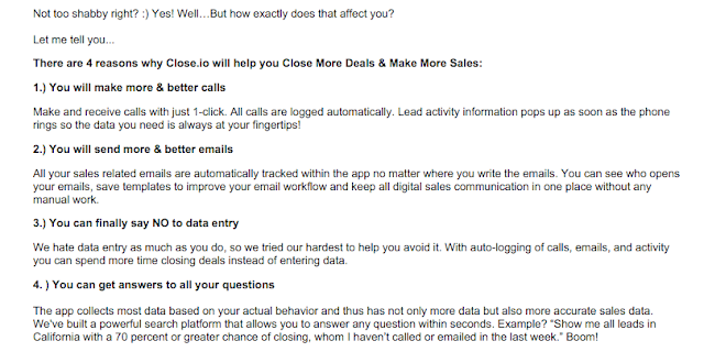
About a week after a new app signup for Close.io, a sales CRM tool, they trigger a very long email from CEO Steli Efti.
Why does this message clock in at over 1,000 words? It’s sharing many stories, all designed to build a bridge to the reader and hopefully ferry them over closer to activation and engagement.
Instead of saying something like “Get started because Close.io is the best!” — Steli shows you why with a resonating origin story. You learn that the Close.io team is solving a pain they had experienced firsthand. That’s why the specific descriptions of existing solutions that turn people into “manual data-entry-monkeys” feels magnetic. They’ve walked in your shoes, their product started out as their own secret sales sauce — this is Close.io’s version of showing that they’ve been in moms’ kitchens and understand their needs.

After testimonial quotes from real-life happy customers, Steli brings the focus back to you. Envision your future — you’ll make better calls and emails, escape the data-entry monkey zoolife, and gain sales data insights — and here are all the details on how that all comes into existence.
Casetext
Casetext is a handy platform for legal writing, research, and publication. Their mission is to make legal knowledge and resources free and understandable. Here’s an email Casetext sent out about one of its contributors Leah Litman, who has written about retroactivity of a law affecting convictions.

The message describes how Leah’s Casetext piece was cited in a legal brief to the Supreme Court, providing a concrete example of the reach and impact that publishing your work on Casetext and being part of its community can have. Your words can go all the way to the top!
Instead of listing out cool, snazzy features or even a bunch of abstract benefits, Casetext succeeds in making all that come together in telling Leah’s story.
The call-to-action button is a great concrete touch, too:

Instead of something generic like “learn more” or “sign up” — it’s a specific and relevant direction: start writing!
Appcues
Appcues, a user onboarding tool, unsurprisingly has put some thought into their triggered activation emails. A few days after you sign up for the product, you get an email with the subject line “Honestly, I was blown away…”

The email highlights one specific company, StoryboardThat, and the specific successes — 112% increase in conversions! — they had using Appcues.
This is a story that will resonate with Appcues’s target audience: here’s a real-life small team that has to deal with many competing priorities but wanted to make their user onboarding more effective. Here is what actually happened after they starting using Appcues, including this impressive A/B test result that blew the customer away.

Their call-to-action button copy is on point too. Even though the link simply takes you into the app, the message is not about signing in or checking Appcues out. Instead, it’s about the very clearly defined goal that the reader has: increase your conversion rate.


Finally, the Appcues team includes the picture of the person featured in the story, which makes it easier to see and understand who was impacted. Aaron is a real person, very much like you, who wants to increase conversion rates without having to wrangle a bunch of code.

Telling relevant stories, showing specific examples, and using concrete language is simply part of good writing and effective communication. Still, concreteness is a remarkably helpful principle that keeps you thinking about your reader and customer’s experience. It battles against your curse of knowledge, the fact that your product or business takes up such a large part of your mind compared to a visitor or prospect, or even loyal customer, and often gets in the way of getting your actual point across.
Our emails and messages shouldn’t be death-by-information but helpful bridges and balloons that bring people up and over to where they want to go.
by Janet Choi




вторник, 25 декабря 2018 г.

Information mapping


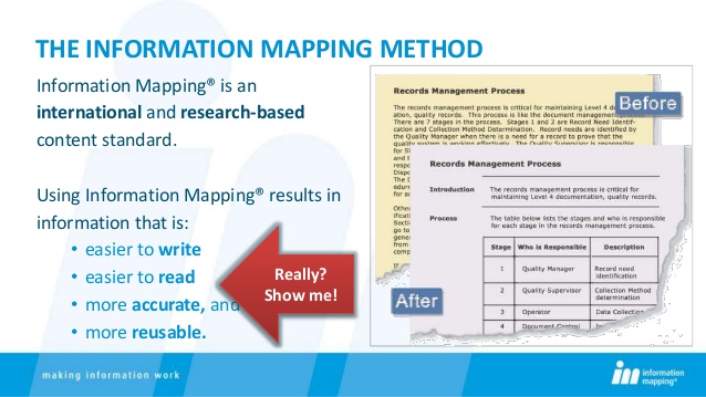
Information mapping is a research-based method for writing clear and user focused information, based on the audience's needs and the purpose of the information. The method is applied primarily to designing and developing business and technical communications. It is used as a content standard within organizations throughout the world.

Overview of the information mapping method

The information mapping method is a research-based methodology used to analyze, organize and present information based on an audience's needs and the purpose of the information. The method applies to all subject matter and media technology. Information mapping has close ties to information visualizationinformation architecturegraphic designinformation designdata analysisexperience design, graphic user interface design, and knowledge management systems.

Components of the method

Information mapping provides a number of tools for analyzing, organizing and presenting information.

Information types

Some of Robert E. Horn's best-known work was his development of the theory of information types. Horn identified six types of information that account for nearly all the content of business and technical communications. The types categorize elements according to their purpose for the audience:
Information TypeDescription
ProcedureA set of steps an individual performs to complete a single task
ProcessA series of events, stages or phases that occurs over time and has a specific outcome
PrincipleA statement designed to dictate, guide or require behavior
ConceptA class or group of things that share a critical set of attributes
StructureA description or depiction of anything that has parts or boundaries
FactA statement that is assumed to be true

Research-based principles

The information mapping method proposes six principles for organizing information so that it is easy to access, understand, and remember:
PrincipleDescription
ChunkingBreak up information into small, manageable units
RelevanceLimit each unit of information to a single topic
LabelingLabel each unit of information in a way that identifies its contents
ConsistencyBe consistent in use of terminology as well as in organizing, formatting and sequencing information
Accessible detailOrganize and structure information so those who need detail can access it easily, while those who don't can easily skip it
Integrated graphicsUse graphics within the text to clarify, emphasize and add dimension

Units of information

Documents written according to information mapping have a modular structure. They consist of clearly outlined information units (maps and blocks) that take into account how much information a reader is able to assimilate.
There is an essential difference between an information unit and the traditional text paragraph. A block is limited to a single topic and consists of a single type of information. Blocks are grouped into maps, and each map consists only of relevant blocks. The hierarchical approach to structuring information greatly facilitates electronic control of content via content management systems and knowledge management systems.

Advantages of information mapping

The information mapping method offers advantages to writers and readers, as well as to an entire organization.

Advantages for writers

Information mapping offers these advantages for writers:
  • An easily learned systematic approach to the task of writing that once learned, enables writers to minimize down time and start writing immediately
  • A subject-matter independent approach that can be applied to all business-related or technical content
  • A content standard that greatly facilitates team writing and management of writing projects
  • Enhanced writer productivity, with less time required for both draft development and review, and
  • Easy updating and revision of content throughout its life cycle

Advantages for readers

Information mapping offers these advantages for readers:
  • Quick, easy access to information at the right level of detail, even for diverse audiences
  • Improved comprehension
  • Fewer errors and misunderstandings
  • Fewer questions for supervisors, and
  • Shorter training cycles, less need for re-training

Advantages for organizations

Also an entire organization can benefit from using a content standard like information mapping if the method is used with the following objectives in mind:
Revenue growth by reducing time to create content and accelerating time to market
  • Cost reduction by capturing employee knowledge, increasing operational efficiency, reducing support calls, and decreasing translation costs
  • Risk mitigation by increasing safety and compliance

History[edit]

Information mapping was developed in the late 20th century by Robert E. Horn, a researcher in the cognitive and behavioral sciences. Horn was interested in visual presentation of information to improve accessibility, comprehension and performance. Horn's development of the information mapping method has won him recognition from the International Society for Performance Improvement and the Association for Computing Machinery.

Review of research

Many independent studies have confirmed that applying the information mapping method to business and technical communications results in quicker, easier access to information, improved comprehension and enhanced performance. It also facilitates repurposing for publication in different formats.[citation needed]
Doubts have been raised over the strength of the research Horn uses to justify some of his principles. For instance, his chunking principle requires lists, paragraphs, sub-sections and sections in a document to contain no more than 7±2 chunks of information.[1] Horn does not state where he got this principle, but an Information Mapping website stated that the principle is "based on George A. Miller's 1956 research".[2] Miller did write a paper in 1956 called "The Magical Number Seven, Plus or Minus Two: Some Limits on our Capacity for Processing Information", but its relevance to writing is tenuous.[3] Miller himself said that his research had nothing to do with writing.[4] Insisting that lists, paragraphs, sub-sections and sections throughout a document contain no more than 7±2 chunks of information paradoxically assumes that the size of what is not read in a document can influence a reader's ability to comprehend what they do read.[3]

References[edit]

  1. ^ R.E. Horn, Developing Procedures, Policies & Documentation, Info-Map, Waltham, 1992, page 3-A-2.
  2. ^ "Mapping FAQs". Infomap.com. Archived from the original on 2010-02-18. Retrieved 2017-03-14.
  3. Jump up to:a b Geofrey Marnell, Essays on Technical Writing, Burdock Books, Brighton, 2016, pp. 111–155).
  4. ^ See http://members.shaw.ca/philip.sharman/miller.txt, Viewed 14 January 2011.

Further reading[edit]

  • Robert E. Horn. Mapping Hypertext: The Analysis, Organization, and Display of Knowledge for the Next Generation of On-Line Text and GraphicsISBN 0-9625565-0-5
  • Robert E. Horn. How High Can it Fly? Examining the Evidence on Information Mapping's Method of High-Performance Communication. Note: This publication is available for download on Horn's website: Chapter One and Chapter Two.

Information Mapping is a documentation methodology, developed by Robert E. Horn in 1972. Documents developed according to the Information Mapping methodology have an instantly-recognizable visual style. This is probably because most authors (or organizations) adopting the methodology focus on the style of the Information Mapping documentation itself, copying the style used by Information Mapping Inc. for their own documentation on Information Mapping. However, Information Mapping really stipulates the structure of the information, rather than the visual display of it. It is perfectly possible to adhere to the methodology but use a visual style that is markedly different to what is commonly thought of as 'Information Mapping documentation'.
Information Mapping is built on seven key principles. These are:
  1. Chunking;
  2. Relevance;
  3. Labeling;
  4. Consistency;
  5. Integrated graphics;
  6. Accessible detail;
  7. Hierarchy of chunking and labeling.

Chunking

The methodology states that:
"Writers should group information into small, manageable units."
Information Mapping defines a 'manageable unit' as "no more than nine pieces of information", which is based on the oft-quoted 'seven-plus-or-minus-two' rule. Information Mapping dictates that this should apply to all levels of documentation - so a manual should have no more than nine chapters, and a bulleted list should have no more than nine list items. However, as discussed in Writing user instructions, this is not always practicable or necessarily desirable. That said, this principle - that information should be grouped into small, manageable units - is good advice from a comprehension perspective.

Relevance

The methodology states that:
"Writers should make sure that all information in one chunk relates to one main point based on that information's purpose or function for the reader."
Put simply, this rule states that a block of information should contain only one type of information. This means that you should not mix (for example) instructions with descriptions. Obviously both of these types of information are permissible (and often necessary) within the same publication. Information Mapping just states that they should be in separate 'blocks' within the document. So you may have a section called "How the XYZ works" and another called "Replacing the widget on the XYZ".

Labeling

The methodology states that:
"After organizing related sentences into manageable unit, writers should provide a label for each unit of information."
This rule states that each 'chunk' of information should have a 'label'. Many proponents of Information Mapping think that this label should appear (traditionally) on the left of the block of information, and word-wrapped within the label column. However, this is not strictly necessary. It is perfectly valid for the label to appear as a 'normal' heading that stretches into the 'content' column. In this context, 'labeling' is best interpreted as providing adequate headings, although headings will typically appear much more often in documents developed according to the Information Mapping methodology than in 'regular' documents.

Examples:
1. 'Traditional' Information Mapping block:

Company policy for system Userids

All users are required to keep their password secret. Users must change their password the first time they log onto the system, and then once a month thereafter. If a user does not change their password for 35 days, they will be prompted to do so by the sytem when they attempt to log on.
2. Adapted Information Mapping block:
Company policy for system Userids
 All users are required to keep their password secret. Users must change their password the first time they log onto the system, and then once a month thereafter. If a user does not change their password for 35 days, they will be prompted to do so by the sytem when they attempt to log on.

The important thing to remember is that labels must stand out from the text, to allow quick scanning (navigation via the labels). For this reason, it is recommended that the 'content' is always significantly indented (as shown in Example 2 above).

Consistency

The methodology states that:
"For similar subject matters, writers should use similar words, labels, formats, organizations, and sequences."
Consistency should be adhered to on two levels:
  • Consistency in language;
  • Consistency in format and structure.
Consistency in the language used within a document and across multiple documents within the same documentation set is important, as readers will rapidly become accustomed to the language used and will not have to 'decipher' the text. That is, they will not have to think about the meaning of a word, but will know intuitively (based on their earlier intraction wih this word) what is meant. If you use different words or phrases for the same thing, the user will be required (perhaps subconsciously) to decide each time whether this actually is the same thing as was referred to previously, or is something different. This will increase the time it takes them to assimilate the information.
Consistency in the format and structure of a document is also important. Within a single document, headings should be used consistently. This includes using the same size and typeface for headings at the same level, and also using headings at the same level of granularity. Across documents, consistency can be thought of as providing the same information in the same type of document. For example, if you are developing a suite of user procedures, then every user procedure document should contain the same information, at the same point in the document, and using the same headings and labels.

Integrated graphics

The methodology states that:
"Writers should use diagrams, tables, puictures, etc. as an integral part of the text, not as an afterthought added on when the writing is complete."
This simply means that graphics should be included wherever they are useful. This rule was probably included as a reaction to the prepondency for text-only documents. Integrating graphics typically gives a document a 'lighter' (less-dense) feel, and therefore facilitates comprehension. There are also times when a picture can show instantly what it would take several paragraphs of text to explain.
However, graphics in technical communications must always be functional. The Information Mapping documentation states that "approximately 50 percent of the adult population learns better from pictures and other graphics than from words", but this means that approximately 50% learn better from text! Therefore, graphics should always be in support of the text, and not as an alternative to it.
Note that Information Mapping considers tables to be 'graphics' as well - which explains their extensive use in Information Mapping. However, given that most tables contain text only, it is better to exclude tables from the definition. This allows you to better focus on 'real' graphics (including photos, technical illustrations, and charts and graphs) and identify opportunities for including these in a document.

Accessible detail

The methodology states that:
"Writers should write at a level of detail that makes the information the reader needs readily accessible, and makes the document usable for all readers. In other words, put what the reader needs where the reader needs it. Include clearly labeled overviews, reviews, descriptions, diagrams, and examples for all "abstract" presentations. Place the diagrams, and examples close tothe text they illustrate."
This principle can best be interpreted as simply providing information to a level of detail that is useful to the readers, and then making sure that the readers can easily-locate the relevant detail.
For example, in a set of maintenance instructions, saying simply "Remove the spigot shaft" may not be sufficient. Perhaps the reader does not know how to do this. Consider providing instructions explaining exactly how to remove it. Perhaps the reader is even unfamiliar with exactly what a spigot shaft is, and where it is located. So provide a diagram of one, and/or a photograph of a spigot shaft in-situ. Then clearly label each element - the instructions, the diagram and the photograph - so that users can directly locate them and understand what the element is showing.

Hierarchy of chunking and labeling

The methodology states that:
"Writers should organize small, relevant units of information into a hierarchy, and provide the larger group(s) they have created with a label(s)."
At its simplest, this rule simply means that:
  1. A document should have a title (label in Information Mapping terminology);
  2. The document should be split into sections (maps);
  3. Each section should have a title (label);
  4. Each section should be split into units of information (blocks);
  5. Each unit of information should have a title (label).
Some authors struggle with Information Mapping, thinking that there are only three levels within this hierarchy: document, map, and block. This assumption is largely borne out of using the Information Mapping documents as an example, and using the Information Mapping templates which indeed only include these three levels.
However, if you consider this rule in conjunction with the 'chunking' rule, it effectively supports as many levels of the hierarchy as is necessary - as long as each node in the hierarchy has no more than nine sub-nodes.

It is also often assumed that heading numbers are 'no allowed', but again, this is a fallacy. In a three-level hierarchy, where the document is the highest level, and there are no more than 9 nodes at each level, there is not really a need for section numbers. However, once additional levels are inroduced, or the number of nodes is increased, heading numbers - and specifically hierarchical heading numbers (1, 1.1, 1.2, 1.3, 2, 2.1....) can greatly aid navigation. Information Mapping does not explicitly forbid them, so they can be used where it helps.

Example:

Corporate Security Policy

1. Controls on system access

1.1 System userids

Each user will be granted a unique password-protected userid which will allow them access to all (and only) functions required to perform their job. Userids must not be shared with other users, under any circumstances.
1.2 System passwordsAll users are required to keep their password secret. Users must change their password the first time they log onto the system, and then once a month thereafter. If a user does not change their password for 35 days, they will be prompted to do so by the system when they attempt to log on.
2. Controls on physical access to buildings

2.1 Card key

etc.