Presentation of data from market research
Presentation of data is important because it converts raw data into a form that is easier to understand. Information can be displayed as:
Table/tally chart:
It is the most suitable method of presenting data when raw data is needed. However, it offers little more than that and the information should be converted into other forms if it needs to be understood or analysed carefully. It is sufficient for info that is brief or does not contain a lot of different things.
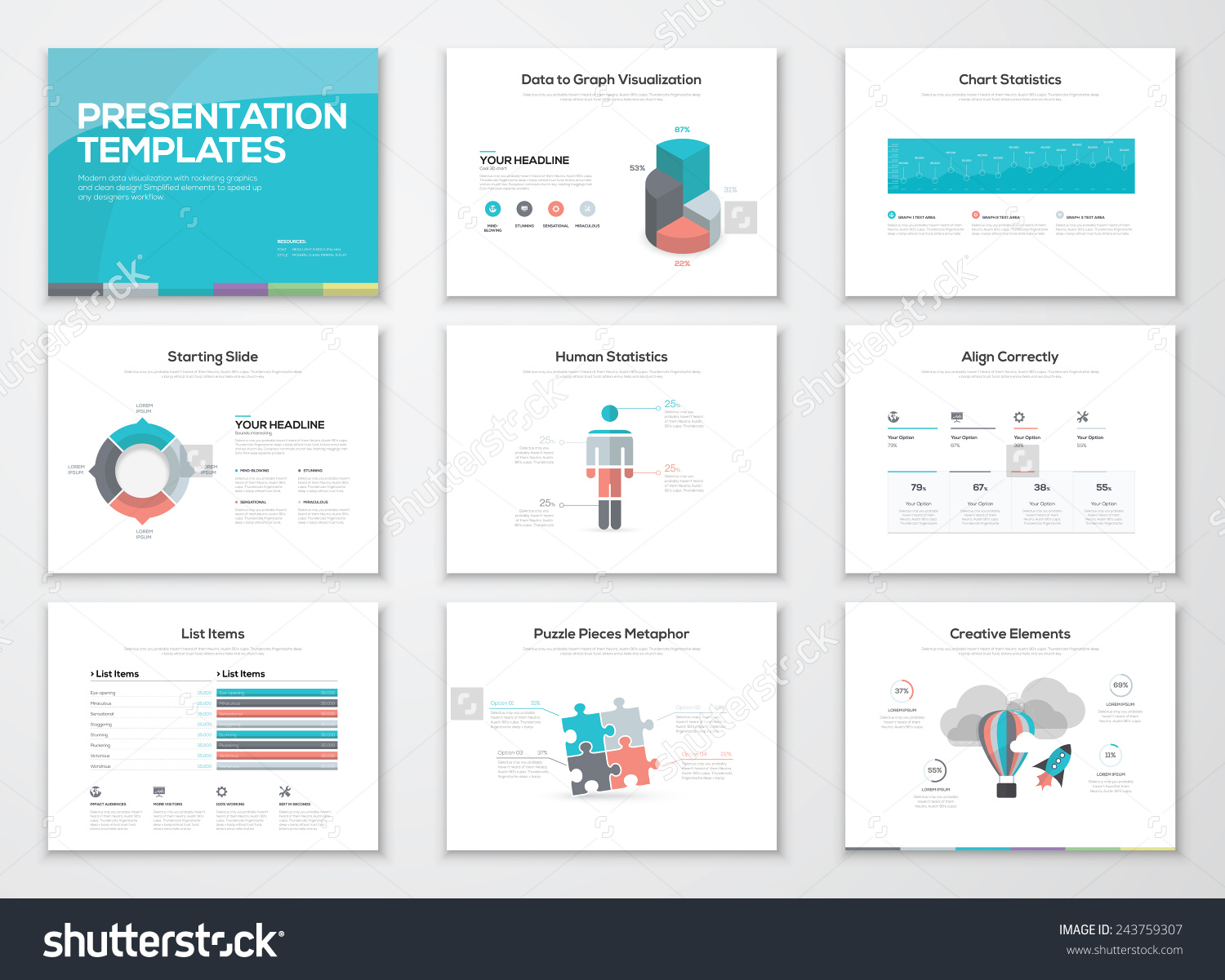
Bar chart:
Charts are a more meaningful and attractive way to present data. They are normally used to compare two or more sets of stats with each other.
Pictogram:
It is similar to a bar chart but uses symbols instead of columns. It becomes extremely effective if the data is short and simple.
Pie chart:
Pie charts are ways to show the proportion that each components take up compared to the total figure.
Line graph:
Graphs show the relationship between two variables. It can be drawn in a straight or curved line. It is usually to compare things with time and to identify trends.
Alternative ways of presenting information for coursework
Tables
Tables could be also be used to present data in situations such as when people are interviewed on why they like a product and they are given multiple choices.
Photographs
Photos can be used to help illustrate your points or support your work. However, avoid adding them to your work just to make them more attractive.
Diagrams
Diagrams are used to simplify information. It can be used to show relationships of things which all leads to the same root, which is usually at the centre of the diagram. It can also be used to show variation, e.g. diagram for ways to save water with different ways to do so branching out from the centre of the diagram.
Maps
Maps are usually used to present location or transport routes, etc… They aim to make the information as clear as possible to the reader. This of course, only applies to certain types of information where words and numbers cannot express them.
Presentation of data is important because it converts raw data into a form that is easier to understand. Information can be displayed as:
Table/tally chart:
It is the most suitable method of presenting data when raw data is needed. However, it offers little more than that and the information should be converted into other forms if it needs to be understood or analysed carefully. It is sufficient for info that is brief or does not contain a lot of different things.
Bar chart:
Charts are a more meaningful and attractive way to present data. They are normally used to compare two or more sets of stats with each other.
Pictogram:
It is similar to a bar chart but uses symbols instead of columns. It becomes extremely effective if the data is short and simple.
Pie chart:
Pie charts are ways to show the proportion that each components take up compared to the total figure.
Line graph:
Graphs show the relationship between two variables. It can be drawn in a straight or curved line. It is usually to compare things with time and to identify trends.
Alternative ways of presenting information for coursework
Tables
Tables could be also be used to present data in situations such as when people are interviewed on why they like a product and they are given multiple choices.
Photographs
Photos can be used to help illustrate your points or support your work. However, avoid adding them to your work just to make them more attractive.
Diagrams
Diagrams are used to simplify information. It can be used to show relationships of things which all leads to the same root, which is usually at the centre of the diagram. It can also be used to show variation, e.g. diagram for ways to save water with different ways to do so branching out from the centre of the diagram.
Maps
Maps are usually used to present location or transport routes, etc… They aim to make the information as clear as possible to the reader. This of course, only applies to certain types of information where words and numbers cannot express them.

